Role:
Research Lead & Partner Liaison
Role:
Tiffany Choi, Sujin Kim, Zhi Qiu
Timeline:
21 Weeks, 2026

The Discovery Cube Potatoes 🥔 (our team's nickname, courtesy of our museum partners)

UX Research and Interface Design for
Discovery Cube Santa Ana, CA
Overview
The “Macroverse” is an upcoming science exhibit where guests “shrink” before entering a laboratory filled with mini games. Inside, patrons are challenged to practice four core character traits:
Dynamic
Curious
Collaborative
Tenacious
Try different games
Learn more
Play with others
Try games again
Problem Statement
How might we encourage and inspire users of varying age groups to practice the 4 character traits and carry those lessons beyond the context of the exhibit?
Design Brief:
3 Screen Touchpoints

1) Exhibit Onboarding
Entrance, RFID setup

AI rendering of exhibit floor provided by Discovery Cube

2) Game Check-In
At each game queue

3) Contribution Kiosk
Point checker stations near exit
Research in the Problem Space
DISCOVERY PHASE
Context Immersion
To learn how to teach the 4 character traits, we first investigated existing resources for character education.
Lit Reviews
What does the existing literature say about childhood education?
Initial Learnings
Purpose-driven learning (PDL) is key.
Comp Analysis
How do other museums carry-out teaching strategies?
Initial Learnings
Some signage had a lot of text, but unsure how successful those are.
Expert Interviews
What patterns do educators see with young learners?
Initial Learnings
Less words > more!
Affinity Diagramming
2 rounds of clustering, and 11 themes emerged


CLIENT ALIGNMENT
Mild, Medium, Spicy Workshop (idea courtesy of Sujin’s mentor)
Review the 11 research findings to agree on concept prioritization. This was a great moment to lean into our partner’s expertise.

Mild
• Heightened curiosity and engagement is a possible indicator of topics “clicking” for kids
• Peer work scaffolds toward independence

Mild
• Ownership leads to feeling invested
• High-value failure is valuable when kids have space to build tenacity
• Foster a safe space for students willing to try

Spicy
• The boundary between an engaging vs. discouraging challenge is thin
CONVERGE
Verify our Problem Understanding
No UI designs yet! Just low-fidelity prototype testing to deepen our understanding of user motivations.
Existing user questions:
1. What moments can we reintroduce character-building to achieve familiarity with the concepts?
2. How can we get visitors to recall their trait-related actions?
3. How can we leverage competition without contributing to learner shutdowns?
4. How well do users understand point-earning?
Crazy 8 Workshops - rapid prototype ideas to answer existing questions
Storyboards - focus on the context, the user’s experience and their emotions throughout
Paper prototype testing - observe what teaching methods cause teachings to “click” for kids
• Gameplay
• Speak aloud


2 Problem Areas Found
1
Disinterest in Character Building
Test participants understood point collection, but did not consistently connect their in-game success to the character traits being practiced, suggesting a need for more tangible reinforcement. Users provided feedback that the collective experience was disjointed.
2
Purpose of the Bonus Screen
With the Game Check-out flow being optional, it raises a question how to best utilize this.
Research in the Design Space
MULTIPLE APPROACHES
A/B Testing
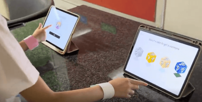
Two prototype flows, testing approaches to animation, point-upgrades, and name generator.
Prototype A
Design Ideas:
• Personal Avatar
• Automatic Upgrades
• Illusion-of-choice name selection
Initial Findings
• Most excitement with avatar and name selection
Prototype B
Design Ideas:
• NPC Characters
• Manual Upgrades
• Slot machine style name generation
Initial Findings
• Needs illustration to show how to scan
• Character trait words are big, but gets adults involved
• Younger kids may benefit from this style
INFORMED ITERATION
Design Pivots
Applying research findings to the final designs.
Autonomy over Avatar
Agency over choosing their avatar led kids to be excited and engaged. We implemented this into the final design.

Static CTAs were Ignored
CTAs without dynamic effects were ignored. During observations, kids only clicked CTAs after they shook.

Uninterested in Upgrade Rewards
Kid’s surprisingly were unenthused by point upgrades at the contribution kiosk. We replaced it with a tactile element which became a fan favorite.

Post-Project Reflection
I was incredibly fortunate to work on this project and have access to on-site user testing. In-person testing skills improve with exposure, and I was able to make many iterations on my interview, observational, and field notes skills.
Designing for families brings about a number of challenges, but also leaves the floor open for innovation and developing educational techniques. Though the project lasted a quick 5 months, I’ve realized how quickly UX researchers can immerse ourselves and add value.